bluntrank

What's a teardown?

A teardown is a written review of your landing page, delivered within 48 hours.

It covers your matchup record and the pages you lost to, the 3 things most likely losing you customers with a fix for each, the order to make those fixes in, and 2 rewritten headline options.

It costs $79, one-time.

bluntrank Teardown · Sample

bluntrank.com

Page reviewed: Landing pageChecked on: desktop and phoneDelivered: within 48 hours

On Oct 15, 2026, we reviewed our own landing page with this teardown, then made all three fixes. The screenshots show the page before them.

The short version

Your landing page looks confident and on-brand, but it's built for voters, not for the people who pay. The paid offer is the easiest thing on the page to miss, it's described in words new visitors don't know yet, and the page never shows a single landing page. Three fixes below, in the order to make them.

Your page today

bluntrank.com · desktop
231
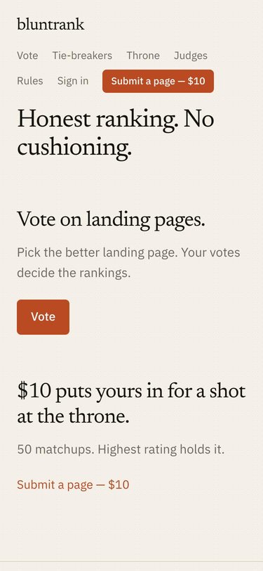
The bluntrank landing page on a phone
On a phone, the menu wraps onto two lines before the headline.
  • 1The paid offer is easy to miss and hard to understand.
  • 2No landing page anywhere on a site about landing pages.
  • 3The headline doesn't say what's ranked or who it's for.

Your matchups

Record—
Rating—
Rank—
Lost to—

Your teardown shows your real record here, plus the pages that beat yours.

Scorecard

AreaRatingWhyFixed by
Call to actionWeakIn the body of the page, the "Submit a page — $10" link is small text under the solid Vote button.1
TrustWeakNo pages, votes or results appear anywhere on the page.2
ClarityWeakThe headline sets a tone but never says what gets ranked.2 3
AudienceWeakThe page speaks to voters first. The people who pay come second.3
LayoutOKClean and uncluttered, but the Vote button outweighs the "Submit a page — $10" link. On phones, the menu wraps onto two lines.1
BrandingStrongCream, rust and serif type feel confident and match the name.Keep

Your fixes

The fixes are listed in the order to make them. Start with number 1.

1

The paid offer is easy to miss and hard to understand.

Call to actionLayoutAbout 15 minutes
Today
The Vote button: big and solid“Submit a page — $10” link: small

What's wrong

In the body of the page, the Vote button is solid rust, while the "Submit a page — $10" link, the only thing that makes money, is small text. A solid "Submit a page — $10" button does exist, but it sits in the top-right menu, away from the text that explains the offer. That text, "50 matchups. Highest rating holds it.", uses words a new visitor doesn't know yet.

Why it hurts

Visitors follow visual weight. A text link under a big solid button reads like a footnote, so many people never notice there's something to buy. The ones who do notice can't picture what their $10 gets them.

The fix

  1. Turn the "Submit a page — $10" link into a solid button, the same size and color as the Vote button, and rename it: Rank my page — $10
  2. Replace the line above it:50 matchups. Highest rating holds it.New lineStrangers compare your page with other landing pages, one pair at a time, 50 times. You get a rating, a rank, and the pages that beat yours.
  3. On the landing page only, take the "Submit a page — $10" button out of the menu. The new button in the page body does that job now, and two identical buttons on one screen compete with each other. Keep the menu button on every other page, renamed to "Rank my page — $10" so the offer reads the same everywhere.
How it should look
bluntrank.com · after fix 1

Honest ranking. No cushioning.

Vote on landing pages.

Pick the better landing page. Your votes decide the rankings.

Vote

$10 puts yours in for a shot at the throne.

Strangers compare your page with other landing pages, one pair at a time, 50 times. You get a rating, a rank, and the pages that beat yours.

Rank my page — $10
Changes from fix 1 are outlined in green. The button removed from the menu is marked in rust.

Why this comes first: it's the quickest change, it's on the only path to revenue, and fixes 2 and 3 build on it.

2

Your landing page describes the product but never shows it.

TrustClarityAbout 45 minutes
Today
Room for a livematchup preview

What's wrong

bluntrank is a visual product: people compare two pages side by side. Your landing page is all text. A first-time visitor never sees a matchup, a ranked page, or a result, and the right side of the screen sits empty.

Why it hurts

People trust what they can see. Without a picture, "vote on landing pages" stays abstract, and nothing shows that the site is active or what a result looks like.

The fix

  1. On the right side of the first screen, level with the headline, show a live matchup preview: two real page screenshots side by side under the question "Which page is better?" It's there to show what bluntrank does, so it isn't clickable. The Vote button is the way in.
  2. On the same right side, level with the offer, show one real result: a page's rating, record and rank. Founders see what $10 gets them before they pay. Explanations stay on the left, examples on the right.
  3. Pull both from live data, so the landing page stays accurate as votes come in.
How it should look
bluntrank.com · after fix 2

Honest ranking. No cushioning.

Vote on landing pages.

Pick the better landing page. Your votes decide the rankings.

Vote

$10 puts yours in for a shot at the throne.

Strangers compare your page with other landing pages, one pair at a time, 50 times. You get a rating, a rank, and the pages that beat yours.

Rank my page — $10

Which page is better?

vs.
Rating
Record
Rank

A real page's result, pulled live

Changes from fix 2 are outlined in green.

Why this comes second: it needs a small build, using the matchup and result displays the site already has, and it works best once the offer next to it is clear.

3

The headline doesn't say what's ranked or who it's for.

ClarityAudienceAbout 10 minutes
Today
A mood, not a message

What's wrong

The first thing visitors read is "Honest ranking. No cushioning." It sets a tone, but it doesn't say what gets ranked, who does the ranking, or who the site is for. The next line, "Vote on landing pages.", speaks only to voters.

Why it hurts

The headline is the one line almost everyone reads. If it doesn't answer "what is this, and is it for me?", founders leave before they reach the offer.

The fix

  1. Keep "Honest ranking. No cushioning." as a small line above the headline, where it adds attitude.
  2. Replace the headline with one that says what happens. Pick one:Honest ranking. No cushioning.Option AYour landing page vs. the rest. Strangers decide.Option BIs your landing page better than theirs? Find out, head to head.
  3. Under the offer line, put the "Rank my page — $10" button and the Vote button side by side, with the word "or" between them, so each kind of visitor sees which one is theirs.
How it should look
bluntrank.com · after fix 3

Honest ranking. No cushioning.

Your landing page vs. the rest. Strangers decide.

Strangers compare your page with other landing pages, one pair at a time, 50 times. You get a rating, a rank, and the pages that beat yours.

Rank my page — $10orVote

Which page is better?

vs.
Rating
Record
Rank

A real page's result, pulled live

Changes from fix 3 are outlined in green.

Why this comes last: it changes the first thing everyone reads. Making it after fixes 1 and 2 lets you see what each change did on its own.

Keep as is

The branding. The cream background, rust accent and serif headings feel confident and match the name. None of the fixes needs a new look, only a clearer message inside the one you have.

Prepared by bluntrank. Questions about your teardown? Email hello@bluntrank.com.

Get the teardown · $79

Back to voting